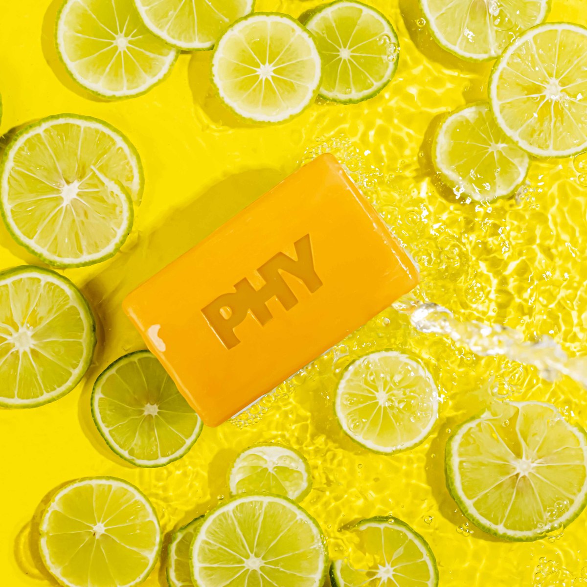
Background choice is mostly settled by where the image is going. Marketplace main images need pure white and there is no negotiation. Everything after that is open, and that is where brands can actually differentiate.
Pure white, and the mistake almost everyone makes
Every major marketplace wants the main image on pure white. What sellers miss is that pure white means 255, and a background that looks white on your screen is very often around 245.
At 245 the tile shows a faint grey box against the marketplace's own white page. It looks subtly cheap next to competitors who got it right, and on some platforms it fails the automated check and the listing gets flagged.
Two ways to get there. Light the background separately so it is brighter than the product and blows to true white in camera, which is the professional approach and gives clean edges. Or shoot on white and correct in editing, which works but eats soft edges if done carelessly.
Getting a true 255 without eating the edge of a white product on a white background is genuinely the hardest routine task in listing photography, and it is worth checking that whoever shoots for you can do it. Ask to see a white pack on white.
Materials, ranked by how well they actually work
Paper roll. Cheap, does not crease, and you cut off the dirty section. It curves into the table to form a sweep with no horizon line, which is what gives you a seamless background. This is what most studios use and it is hard to beat.
Acrylic sheet. White acrylic gives a slight natural reflection under the product. Black acrylic gives a strong clean reflection that looks premium and costs nothing to produce, unlike a fake reflection added in editing which usually looks fake.
Fabric. Convenient to store and it creases, and every crease is a retouching job. Avoid for listings. Fine for lifestyle where texture is wanted.
Foam board. Cheap and rigid, good for small products, and doubles as a reflector.
Real surfaces. Stone, wood, ceramic tile, textured plaster. These are for lifestyle and they photograph far better than printed vinyl imitations of them, which look wrong under directional light because the texture is not really there.
Background ideas that work for the other slots
Once past the main image, the background is doing brand work rather than compliance work.
A single flat colour from your brand palette. Simple, strong at thumbnail size, and it makes a range instantly recognisable as yours in a crowded grid.
Gradient. A colour that falls off darker at the edges holds the eye on the product. Done with light rather than in editing, it looks natural.
Stone or concrete. Reads premium for skincare, grooming and supplements. Neutral enough not to fight the pack.
Natural elements that relate to the product. Limes beside a citrus soap, coffee beans beside a coffee pack, dried flowers beside a fragrance. The rule we work to is that the element should relate to what is in the product, otherwise it is decoration and it dilutes.
Shadow as the whole idea. A hard shadow from a window frame or a leaf, falling across a plain background. Costs nothing, looks expensive, and works well for social.
Wet surfaces. Water droplets and a dark reflective base for anything cold, fresh or hydrating.
Colour choices worth knowing
Do not use a background colour that appears in the packaging, or the product merges into it at thumbnail size.
Light products photograph well on mid tones. Dark products need either a light background or a rim of light along the edge to separate them, or they turn into a silhouette.
Be careful with strongly saturated backgrounds. Coloured light bounces off the background onto the product and tints it, which quietly makes a white pack look pink. It is a real effect and it surprises people.
Consistency is the actual rule
Whatever you choose, hold it across the range. Six flavours on six different backgrounds looks like six different brands sitting next to each other in the grid. One background across the range, changed only when the whole range changes.
This matters most where your own products sit side by side, which is most of quick commerce. Shooting for Zepto goes into that specifically.
For choosing the colours themselves, the 60/30/10 rule is the one worth knowing: one dominant colour, one secondary, one sharp accent, rather than two colours fighting each other.
If you want the white handled correctly and the lifestyle backgrounds designed rather than improvised, our product photography covers both in one session.