What is the 60/30/10 rule in photography?
Give roughly sixty percent of the frame to one dominant colour, thirty to a secondary, and ten to a sharp accent. It comes from interior design and it works because unequal colour is easier to look at than balanced colour.
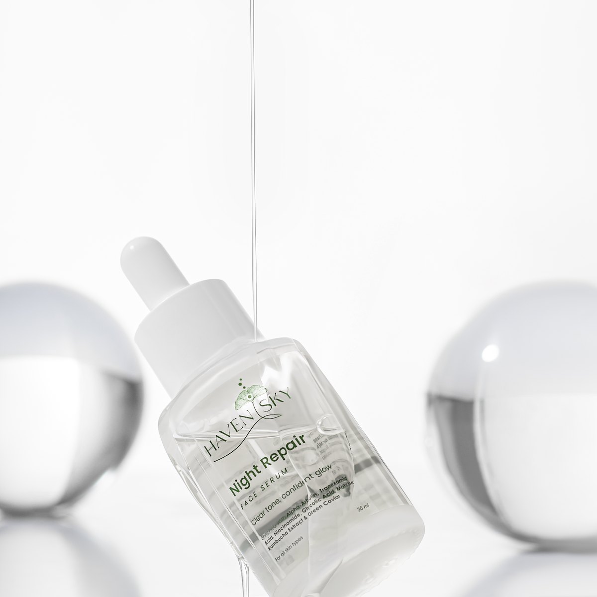
The rule started in interior design, where a room is built from a dominant colour on the walls, a secondary on the furniture, and an accent in the small pieces. Photographers borrowed it because the underlying reason applies to any frame.
**Why it works.** Two colours in equal amounts compete and the eye does not know where to settle. Make one clearly dominant and the hierarchy resolves itself. The ten percent accent then gets disproportionate attention precisely because there is so little of it.
**How it maps onto a product set.** The sixty is usually the background and the largest surfaces. The thirty is the product itself, or the props and secondary surfaces. The ten is the smallest and sharpest element: a cap, a label, a single prop, a flash of a brand colour.
The most useful way to apply it is deliberately backwards. Decide first what you want the eye to land on, make that the ten percent, and build the sixty and thirty to be quiet enough that the accent wins. If your product is the accent it becomes the loudest thing in a soft frame, which is exactly what a lifestyle image is for.
**Where it genuinely helps.** Lifestyle and social imagery, flat lays, gift sets, seasonal and festive shoots, and anywhere a brand palette needs to feel deliberate rather than assembled.
**Where it does not apply.** Marketplace main images. Those are a product on pure white and the rule has nothing to work with. Do not try to introduce colour into a listing main image in the name of composition, because on most marketplaces that is a compliance problem.
**Treat it as a check, not a formula.** Nobody measures percentages on set. What experienced photographers actually do is glance at a frame and ask whether one colour is clearly leading. If two are fighting, one gets reduced. That is the rule in practice.
It is often confused with the 20 60 20 rule, which is a different thing entirely: that one splits an image by depth into background, subject and foreground rather than by colour. We cover that separately.
For the colour choices that make this work on a product set, backgrounds for product photography is the practical companion. Lifestyle and festive sets are where we use this rule most on our own product photography shoots.