Marketplaces give you seven or eight image slots. Most sellers use three. Every unused slot is an objection you left unanswered, and the fix costs nothing extra at the shoot because the product is already on the table.
Think in questions, not angles
The useful way to plan a shoot is not a list of camera positions. It is a list of the questions a buyer asks before they commit, in the order they ask them. Each image answers one.
What is it. What does it look like from the other sides. How big is it. What is in it. How is it used. What do I actually receive.
Answer those six and you have a complete listing.
The core set
Straight on front, at product height. This is the main image on almost every marketplace. Shoot it level with the middle of the product, not looking down at it. Shooting down makes the pack lean away and distorts the label, which is the most common fault we see in seller supplied images.
Three quarter. Turn the product about 30 to 45 degrees. This is the angle that shows two faces at once and makes a flat pack read as a solid object. On most products this is the best looking single frame, and on many it deserves the second slot.
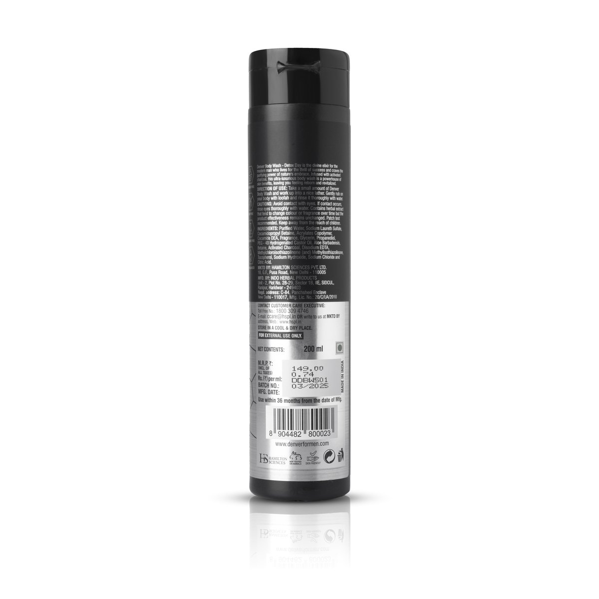
Back label. The one most studios skip and the one buyers in India actively look for. Ingredients, nutrition panel, directions, manufacturing details. If the panel is not legible at listing size, the buyer either leaves or asks a question you then have to answer.
Detail close up. Whatever people ask about. The texture of a fabric, the finish on a cap, the stitching, the weld, the print quality. Look at the questions section on a competitor's listing and shoot the answers.
Scale. In hand, or beside something universally recognised. Size is the single most common source of disappointment and returns in e-commerce, and it is entirely preventable with one frame.
What is in the box. All contents laid out. Turns a vague description into something concrete and reduces the where is the rest of it complaint.
The ones worth adding
Top down. Essential for flat products, tins, palettes, anything where the top face carries the design.
In use. A cream being applied, a tool being held, a food product plated. This is the frame that converts the buyer who understands the product but has not pictured owning it.
Group shot for a range. If you sell six flavours, one frame with all six sells the range rather than one item.
The angle mistakes we see most
Shooting down at everything. Convenient, because it is where your eyes already are. It distorts the product and makes it look small.
Only one angle across a whole catalogue. Cheap to produce, and it makes a brand look like a reseller rather than a manufacturer.
Artistic angles on the main image. A dramatic low angle looks good in a portfolio and performs badly as a main image, where the job is instant recognition at thumbnail size.
Inconsistent angles across a range. If flavour one is shot at 45 degrees and flavour two straight on, the grid looks wrong even to someone who cannot say why.
The rule for the main image
The main image has one job, which is to be recognised in a grid at thumbnail size while someone is scrolling. Straight on, product filling most of the frame, on clean white. Save everything interesting for slots two onward.
On quick commerce platforms this matters even more, because most buyers never open the product page at all. We cover that in how to shoot for Blinkit.
How many is enough
Six to eight per product for a marketplace listing. That sounds like a lot until you realise the setup is already built and the product is already on the table, so the marginal cost of the seventh frame is small. Charging per image, which is how we price, means you can decide slot by slot whether a frame earns its place.
Angles are one half of the plan. The other is knowing the three types of product photography, because a listing needs all three and most sellers shoot only the first.